
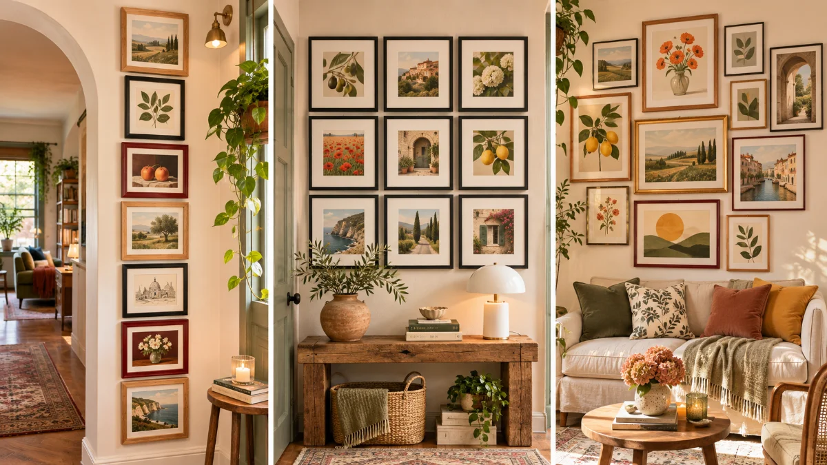
Small walls are tricky. Hang one tiny frame and it looks lost. Hang twenty and the room starts to feel like it’s closing in.
Most apartments are full of these in-between spaces, like the strip beside a doorway, the patch above the toilet, the corner by the table and the wall around the TV. They’re easy to ignore, but they’re also where a gallery wall can make the biggest difference.
That’s why this roundup is all about layouts that fit. You’ll find tight grids, tall columns, single rows and leaning ledges, plus colorful clusters and calm black and white ones. There are ideas for entryways, hallways, bedrooms, kitchens, bathrooms and even the staircase, along with a wall of mirrors for rooms that need more light.
Every one of these gallery wall ideas for small spaces comes with a quick visual guide, so you can see the spacing, the balance or the hanging steps at a glance. Several are renter friendly, and most work with art you already own.
Grab your painter’s tape and let’s find the layout that fits your wall.
1. A Nine Frame Grid Above a Slim Entry Console
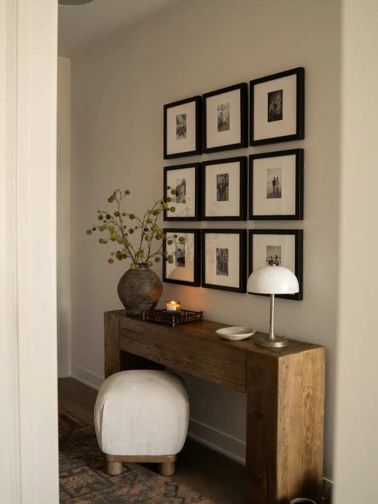
Nine matching black frames in a tight three by three square. That’s the whole trick, and it’s why this small entry feels so calm.
The wide white mats do a lot of the work. Each photo is small, but the mat gives it room to breathe. The grid reads as one clean block, not nine busy pictures. Black and white family photos keep the look quiet.
What makes it work in a tight spot:
- The grid sits inside the width of the console, so the wall and table look like one unit.
- A round clay vase on one end and a white dome lamp on the other frame the grid.
- A soft ottoman tucks under the table, which keeps the walkway clear.
Keep the gaps between frames the same on every side. Uneven spacing is the first thing people notice in a grid.
📐 Hang a Grid That Stays Straight
Trace each frame on kraft paper, cut the shapes out, and tape them to the wall. Move them around until the square looks centered over your table.
Pick one gap size, like 2 inches, and cut a scrap of cardboard to that width. Use it as a spacer between every frame.
Hang the center frame first, then work outward. The grid stays even instead of drifting to one side.
Renting? Light frames like these can go up with picture hanging strips, so there are no nail holes to fill later.
2. A Salon Style Wall That Climbs Around a Tiny Desk Nook
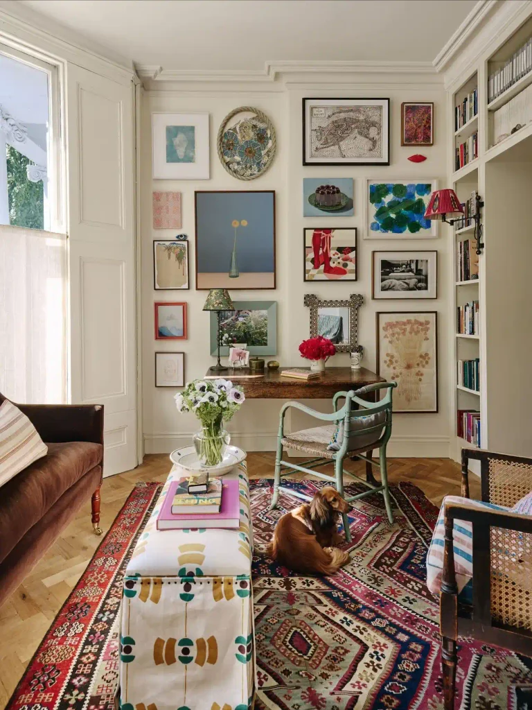
Here the art runs almost up to the crown molding and wraps around a small writing desk. In a room this size, going tall works better than going wide.
No two frames match. There are black, white, raw wood, mint green and red frames, plus an inlaid mirror and a round frame edged in rope. It still feels pulled together because the wall is a soft cream and the gaps between pieces stay tight.
Little objects fill the odd spaces too. A red lips piece and a tiny eye ornament tuck in between the frames.
Steal this: set one large piece just off center, like the blue still life here, and build the smaller frames around it.
Lay the whole thing out on the floor first. With this many shapes, guessing on the wall means extra holes.
Anchor the wall with one big piece placed a little off center.
Keep gaps tight so the whole cluster reads as one shape.
Repeat a color or two across the wall. Here, blues and reds show up again and again.
Spacing frames far apart. On a small wall it looks scattered.
Using only tiny frames. Without a few bigger pieces, it turns into clutter.
Painting the wall a bold color behind a mix this busy. A soft neutral keeps it calm.
3. A Single Row of Oversized Portraits Above the Sofa
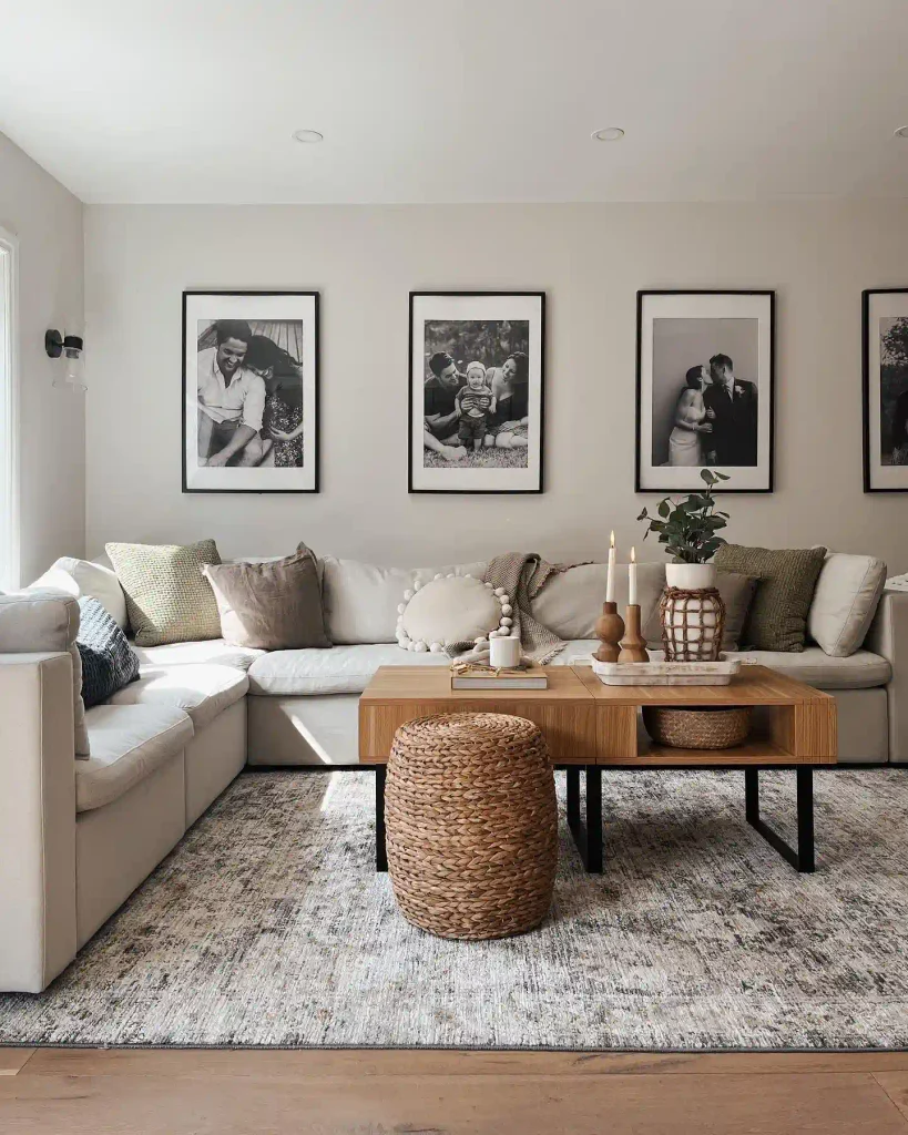
Sometimes fewer frames make a living room feel bigger, not smaller. This wall has just one row of large black frames, each holding one black and white family photo. They’re spaced evenly above a long cream sofa, and a fourth frame runs off the edge of the shot.
Why go big instead of busy?
Many small frames: more to look at, more holes, and the wall can feel cluttered fast.
A few large frames: the eye slides along one clean line, and the wall reads wider.
The row also runs the length of the sofa, so the frames and the couch look like one long unit. Olive and taupe pillows pick up the warmth of the wood coffee table and the woven stool.
Keep the top edges exactly level. In a single row, even a slight tilt shows.
4. Three Staggered Picture Ledges Beside the Bedroom Window
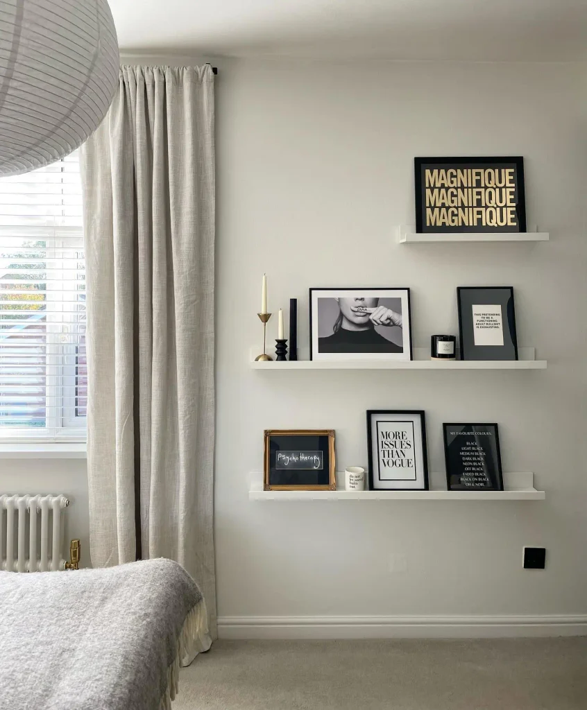
Three white picture ledges stand in for a full gallery wall in this bedroom. Nothing is hung on a nail. Every print just leans.
The top ledge is short and pushed to the right, and the two below run longer. That stagger keeps the stack from looking like a bookcase.
How to style ledges like these:
- Give your boldest print its own short ledge, like the gold on black word print up top.
- Lean two or three frames per ledge, with a little space between them.
- Fill the gaps with small objects. Here that’s a brass candlestick, black candle holders and a candle jar.
- Add one frame that breaks the pattern. The ornate gold frame keeps all that black from feeling flat.
For renters, there are only a few holes to drill, and swapping art takes minutes.
5. A Tall Frame Column for a Skinny Hallway Wall
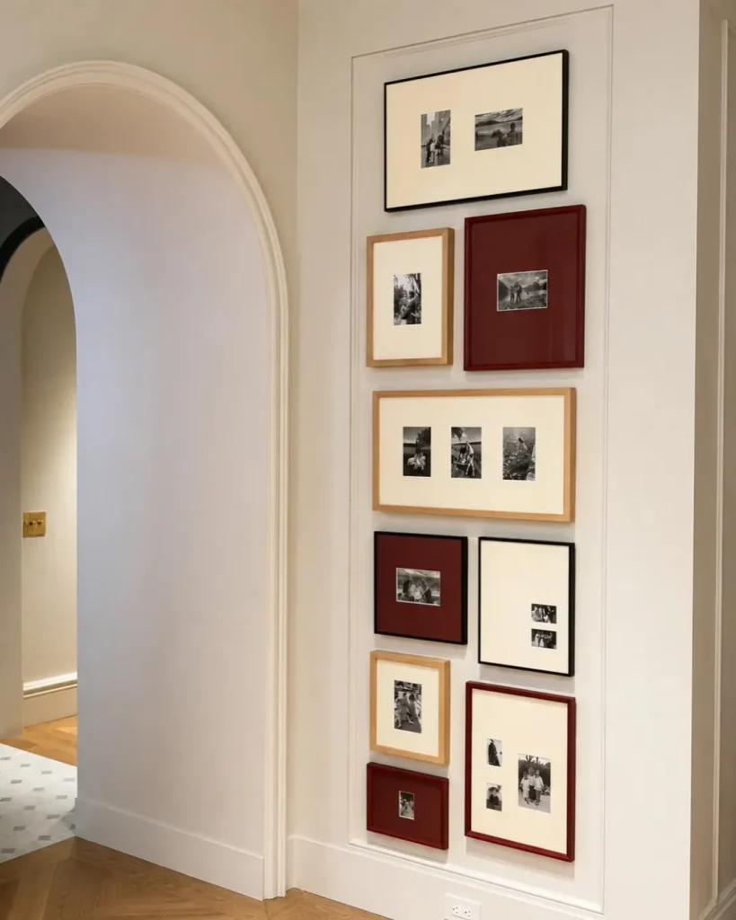
Got a skinny strip of wall between a doorway and a corner? This hallway turns one into the best wall in the hall.
The frames stack in a tall column, never more than two across, and run almost from the baseboard to the ceiling. A painted molding panel boxes them in, and that border makes a busy column look tidy and planned.
The color trick is simple. Only three frame finishes repeat: black, light oak and a deep burgundy. A few burgundy mats echo the red frames, so the color shows up all over the column instead of in one spot.
Some frames hold two or three small black and white prints in one mat. That fits more memories into a narrow space.
On a wall like this, tall and narrow wins over short and wide.
Recreate this column
6. A Black and White Entry Cluster With a Few Spots of Color
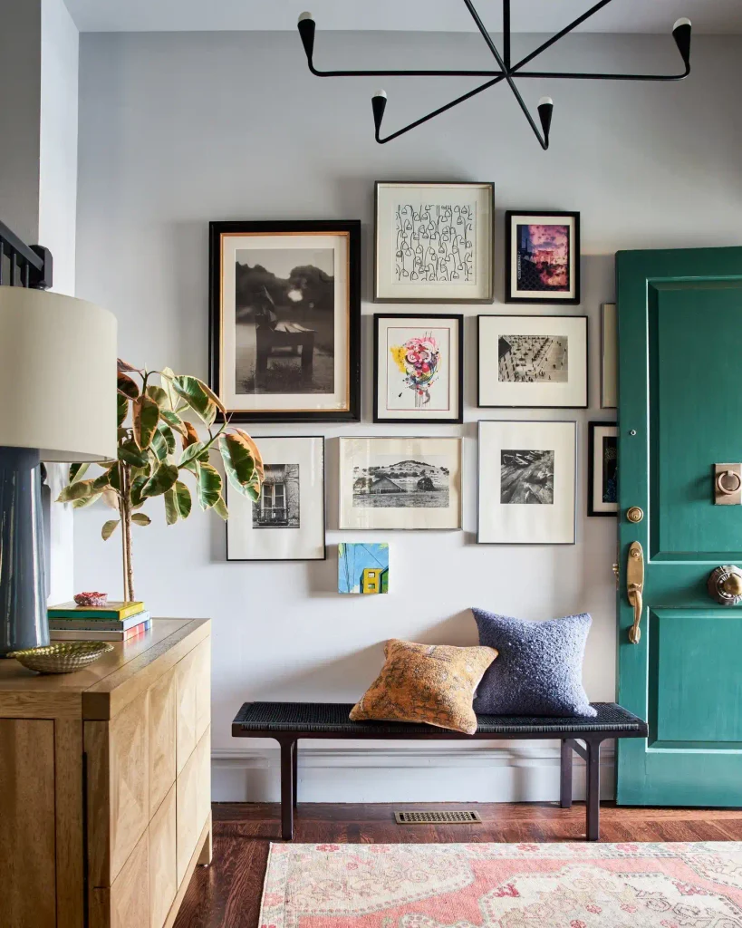
Right inside the front door, this cluster sits over a low bench and keeps going until the door frame cuts it off.
Most of the art is black and white photography in black, silver and gold-edged frames. Then a few color pieces break in: a bright pink abstract, a purple-toned photo and a tiny blue and yellow painting. Since color is rare on this wall, each of those pieces gets noticed right away.
📌 Good To Know
See the small painting hanging alone below the cluster? Dropping one little piece past the bottom edge makes a gallery wall look collected over time, not hung all in one weekend. It also fills the gap above the bench without crowding it.
A couple of frames sit right next to the door and get half hidden when it swings open. Save that spot for art you don’t mind covering.
Leave enough room above the bench so nobody bumps a frame with their head when they sit down to pull on their shoes.
7. An Edge to Edge Color Wall That Echoes the Sofa Below
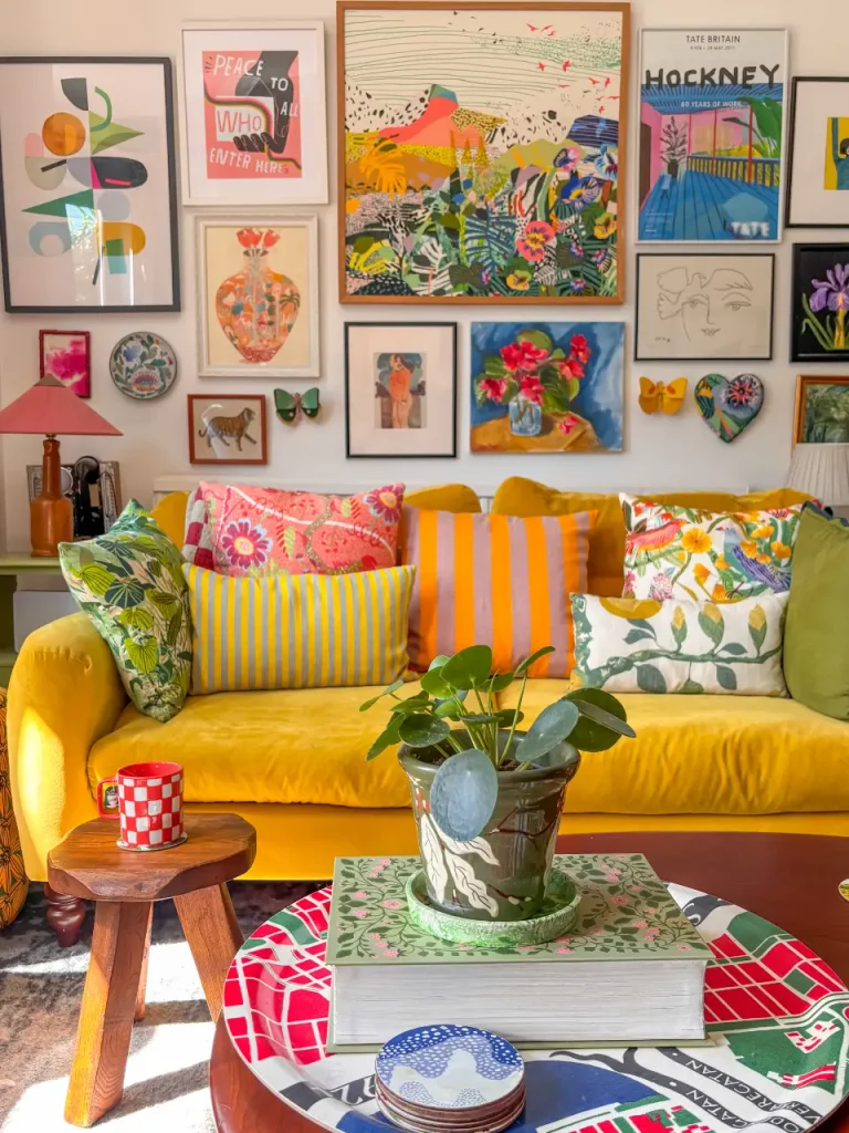
Every inch above this mustard velvet sofa is covered in bright prints, and it still feels friendly instead of loud.
The secret is that the art and the room share the same colors. The pinks, oranges, yellows and greens on the wall show up again in the pillows, the lamp and even a red checkered mug on the stool. Your eye reads one big story, not a pile of separate pictures.
A few pieces aren’t framed prints at all. Paper butterflies, a painted plate and a ceramic heart break up all those rectangles.
One rule if you try this at home: keep the wall itself plain white. With this much color in the art, the wall needs to stay quiet.
| 🎨 Color in the art | 🛋️ Where it repeats in the room |
|---|---|
| Hot pink and coral | Floral pillow, lamp shade |
| Sunny yellow and orange | Velvet sofa, striped pillows |
| Leafy green | Leaf print pillows, potted plant, side table |
| Cherry red | Checkered mug, printed tray |
| Deep blue | Patterned coasters on the table |
8. A Gallery Wall That Wraps Around the TV
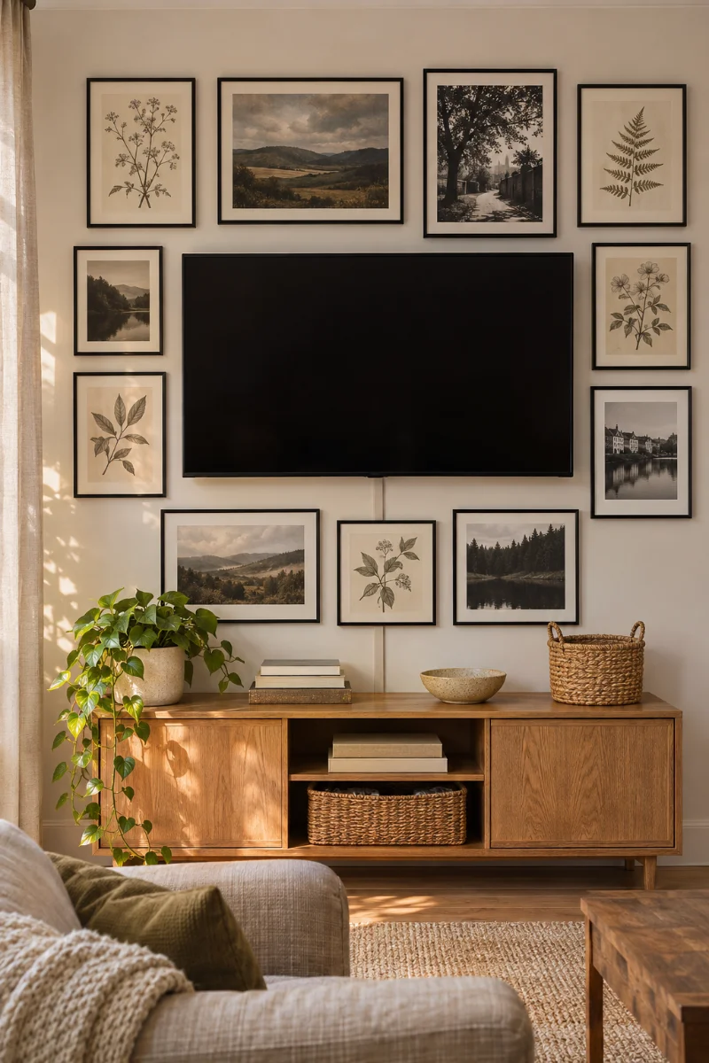
A big black TV screen is hard to hide in a small living room. So stop trying to hide it, and build the art around it instead.
Frames around the screen turn the TV into one more dark rectangle in the mix. When it’s off, it blends right in.
How to set it up:
- Mount the TV first, at a comfortable height for watching from the sofa.
- Choose mostly black frames, with a few dark photos or moody prints, so the screen matches the rest of the set.
- Hang the frames that touch the TV edges first, with the same gap all the way around.
- Build outward from there, keeping the outer shape roughly rectangular.
Hide the cords with a paintable cord cover. One dangling wire ruins the whole effect.
A lone black screen on a big blank wall. Even when it’s off, it’s the first thing anyone sees.
The screen sits inside a cluster of black frames and dark prints, so it reads as part of the art instead of a hole in the wall.
9. A Corner Wrap Gallery Wall for a Small Dining Nook
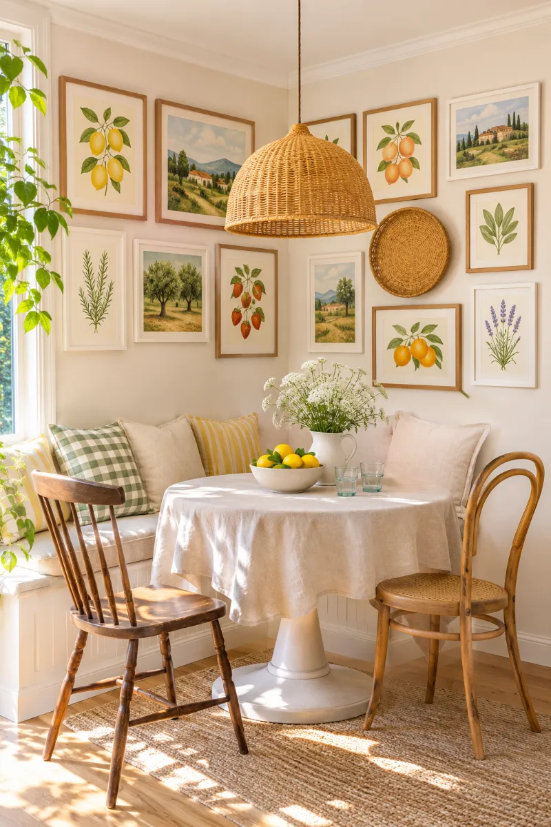
Corners often get left bare in small apartments, but a gallery wall that bends around one makes a dining nook feel finished.
- Plan both walls as one layout. Tape it out on the floor or on paper first.
- Leave matching space on each side of the corner line, so no frame looks folded in half.
- Keep the top edge level across both walls. That line ties the two sides together.
- Put the biggest piece on the wall you see first when you walk into the room.
- Stick to one or two frame finishes, like natural wood and white, so the bend doesn’t look messy.
With a round table and a cushioned bench tucked in, the corner turns into a cozy spot that feels built in.
Art on two walls pulls the eye into the corner. A small nook stops feeling like leftover space and starts feeling like a booth at a favorite cafe.
10. A Small Three Frame Cluster Above the Bathroom Toilet
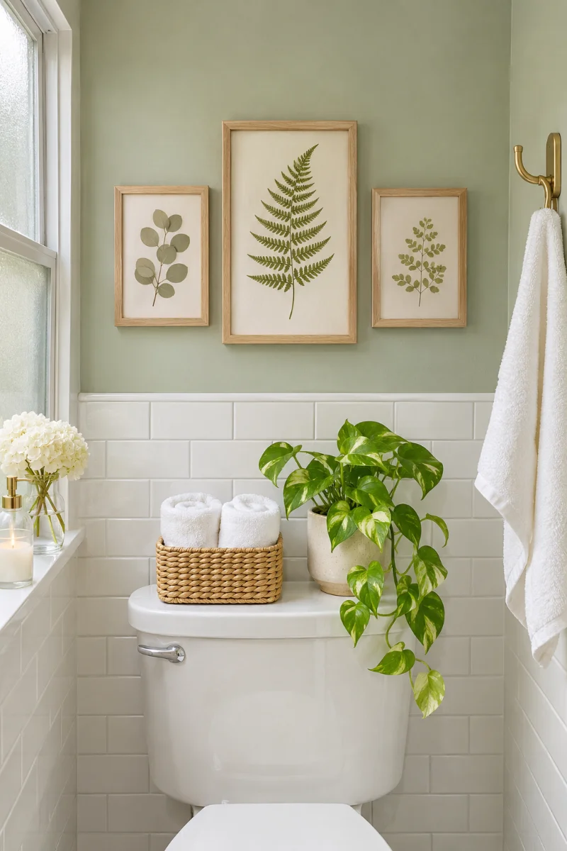
The wall above the toilet is often the emptiest spot in a small bathroom. It’s also the one you look at every single day.
Three small frames are plenty. Hang one taller print in the center with a smaller one on each side. Keep the whole group no wider than the tank below, so it looks anchored instead of floating.
Light, fresh art suits this room. Think pressed botanicals, watercolor seascapes or simple line drawings in light wood or white frames.
Watch the steam. Skip original paintings and family photos you can’t replace, and pick frames that can handle a little damp.
Use frames with acrylic fronts. They’re lighter than glass and won’t shatter on tile.
Choose prints that are cheap and easy to replace.
Run the fan or crack a window after every shower.
Hanging originals or one of a kind photos in here.
Taping unframed paper prints to the wall. They curl fast.
Putting frames where the shower spray can reach them.
11. An Off Center Cluster That Leans Toward a Reading Chair
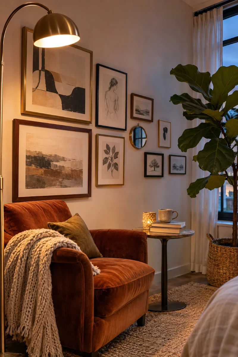
Not every gallery wall needs to be centered. In a reading corner, an off-center cluster that leans toward the chair looks relaxed and planned.
The trick is balance. The heavy side of the cluster sits above the armchair, where the biggest frames go. Smaller frames trail off toward the open wall. A tall floor lamp or a big leafy plant on the other side evens out the weight, so nothing looks tipped.
This setup suits studio apartments, where one wall often has to hold a chair, a lamp and a plant all at once.
Lopsided on purpose looks styled. Lopsided by accident just looks crooked.
🪑 Build an Off Center Cluster
Place the chair, lamp and plant first. The art gets planned around them, not the other way around.
Hang your largest frame right above the chair. That’s your heavy side.
Add medium frames around it, then let the small ones spread out toward the open side.
Step back across the room. If the wall feels like it’s sliding, shift the lamp or plant to the light side to balance it.
12. A Mini Gallery Wall on the End of a Galley Kitchen
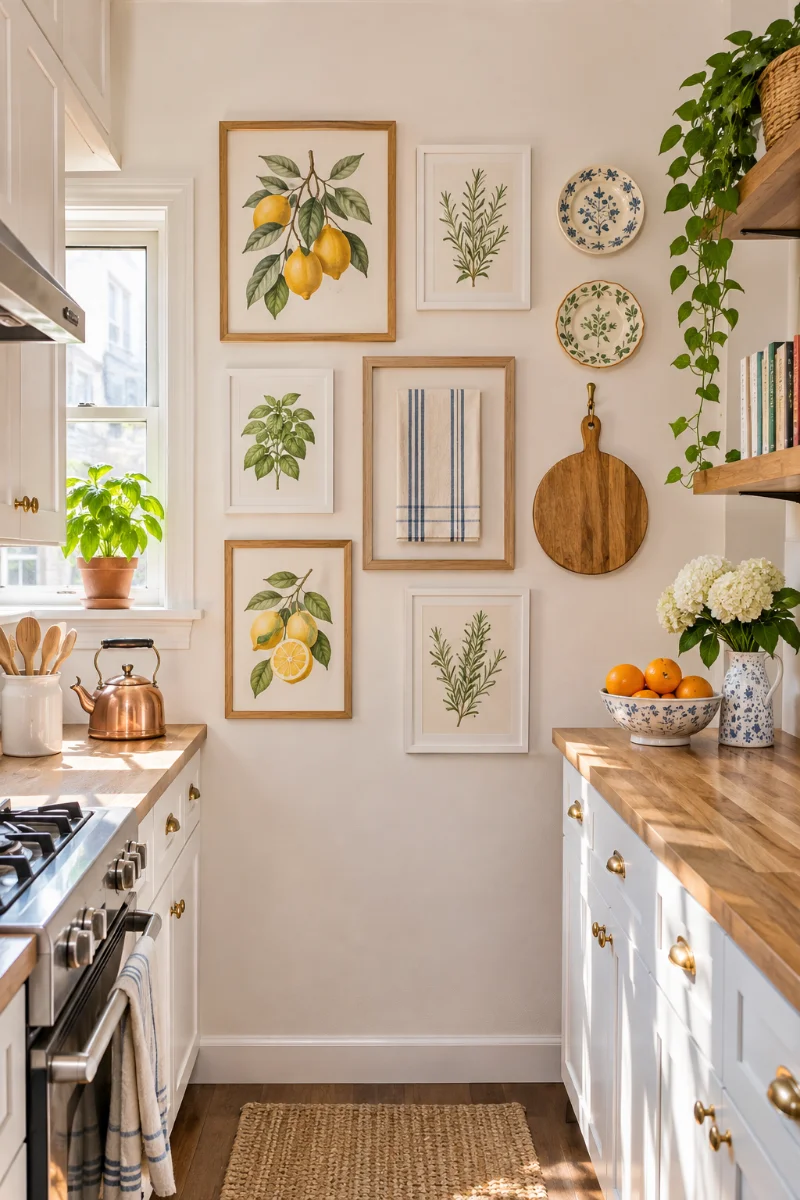
Galley kitchens usually have one short end wall with nothing on it. It’s a great spot for a small gallery wall, because it’s the first thing you see when you walk in.
Keep the art food friendly and a little playful. An old recipe card in a family member’s handwriting, framed simply, will mean more than any store print.
Hung frames or a narrow ledge?
Hung frames: flat to the wall, so they stay out of the way in a tight walkway.
A narrow ledge: easier to swap, but it sticks out and collects kitchen grease.
Keep everything well away from the stove. Heat and splatter dull frames fast.
🍋 Kitchen Art That Works
- ▸Fruit, herb or vegetable prints in simple frames
- ▸A favorite tea towel stretched inside a frame
- ▸Two or three small vintage plates mixed between the frames
- ▸A wooden cutting board hung on a hook as a piece of art
- ▸A handwritten family recipe card behind glass
13. A Low, Wide Cluster That Stands In for a Headboard
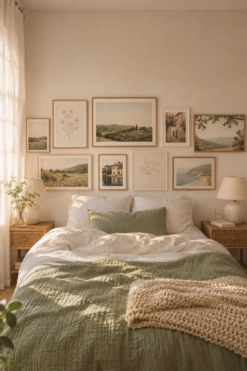
No headboard? A low, wide gallery wall above the bed can do the same job for a lot less money.
Make the cluster wider than it is tall, and stretch it to about the width of the mattress. Hang it fairly low, so the bottom row sits a short way above your pillows. That way it reads as part of the bed, not a random group floating up near the ceiling.
Soft art suits a bedroom. Muted landscapes, line drawings and faded photos in thin frames feel calm when you’re winding down.
Safety first: this is the one spot where frames hang over your head while you sleep. Use light frames with acrylic fronts, and secure each one with two hooks so it can’t swing loose.
14. A Stepped Gallery Wall That Climbs a Narrow Staircase
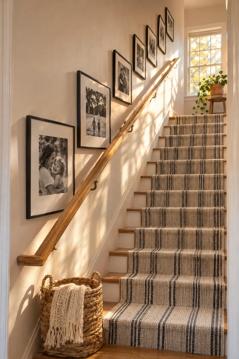
A narrow staircase wall is easy to ignore, but it’s one of the few tall, open walls in a small home.
- Follow the slope. The frames should rise at the same angle as the stair rail, not sit in flat rows.
- Stick to one frame color, like all black or all white. On a slanted layout, matching frames keep things from looking chaotic.
- Go small to medium. Big frames can feel like they’re leaning in on you on narrow stairs.
- Hang at eye level for someone on the steps, not for someone standing at the bottom.
Family photos in date order make a sweet twist here. Walking up the stairs turns into walking through the years.
🪜 Hang Frames Along the Stairs
Run a strip of painter’s tape up the wall, parallel to the handrail, at eye level for someone on the stairs.
Hang the middle frame first, with its center right on the tape line.
Work up and down from there, keeping every frame centered on the tape.
Peel off the tape, then check the gaps from both the top and the bottom of the stairs.
15. A Mixed Mirror Gallery Wall That Bounces Light Around a Dark Room
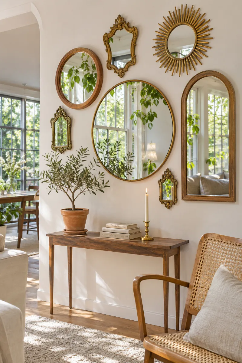
A gallery wall doesn’t have to hold any art at all. A group of mixed mirrors works the same way, and it brings light into a small, dim room.
Choose mirrors in different shapes but only one or two finishes, like brass and natural wood. Each shape does a slightly different job:
Hang the cluster across from a window if you can. That’s where it catches the most daylight and throws it back into the room.
Check what the mirrors will reflect before you drill. A pretty view doubles. So does a pile of laundry.
A small wall doesn’t need a big plan, just the right shape. Pick the spot that bothers you most, tape out a layout, and live with it for a day or two before you pick up the hammer.
Mix in art that actually means something to you, like old photos, a kid’s drawing or a print from a trip. That’s what makes a gallery wall feel like home instead of a store display.
Save this pin to your small space board so these gallery wall ideas for small spaces are ready when you find the right frames.