
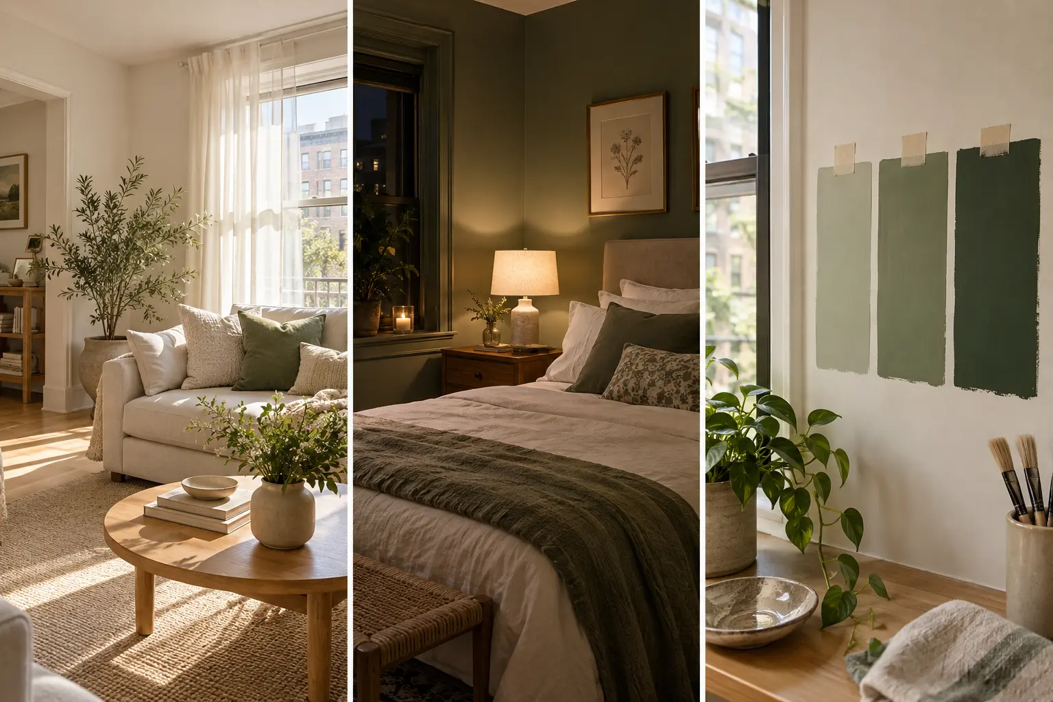
Someone once told you small rooms need white walls. So you painted it white, and the room still feels tight. Maybe a little gray and flat, too. Here’s the truth about light vs dark walls in a small room: neither one wins every time. The right pick depends on your windows, your daylight, and how you want the room to feel.
This guide helps you choose between light and dark paint without guessing. You will check your light, test three sample colors on poster boards, and watch them in morning, afternoon, and night light. By the end, you’ll know which color belongs on your walls and which finish to buy.
Why test this way? Paint chips are tiny, and store lighting lies. A color that looks soft under bright store bulbs can turn muddy on a north-facing wall. Big samples in your own room show you the real color before you spend money on a gallon.
The hands-on work takes about 90 minutes. The testing takes 2 to 3 days, because you need to see each color at different times. None of it is hard. It only takes a little patience. And if you rent, the poster board method lets you test without touching your walls at all.
1. Check which direction your windows face
Window direction decides what kind of light hits your walls all day. Open the compass app on your phone, stand at the main window, and face outside. Then match it below.
- North: cool, soft, bluish light. Light colors can turn gray.
- South: warm, bright light most of the day. Almost any color works.
- East: bright, warm mornings and cooler afternoons.
- West: dim mornings and strong golden evenings.
Live in the Southern Hemisphere? Swap north and south.
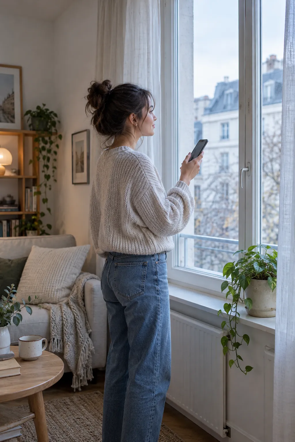
Windows on two walls? Go by the biggest window. It controls most of the light in the room, so it should guide your color choice.
2. Count the hours of direct sun the room gets
A room can face south and still sit in shadow from the building next door. So check the real light, not only the compass. Pick a day when you’re home and look at the room at 9 a.m., 1 p.m., and 5 p.m. Write down whether sunlight lands on the floor or walls each time. Fewer than 3 hours of direct sun means the room is low-light. That matters, because light colors need light to bounce. Without it, they look dull instead of bright, and a deep color often looks better.

3. Decide whether you want the room to feel airy or cozy
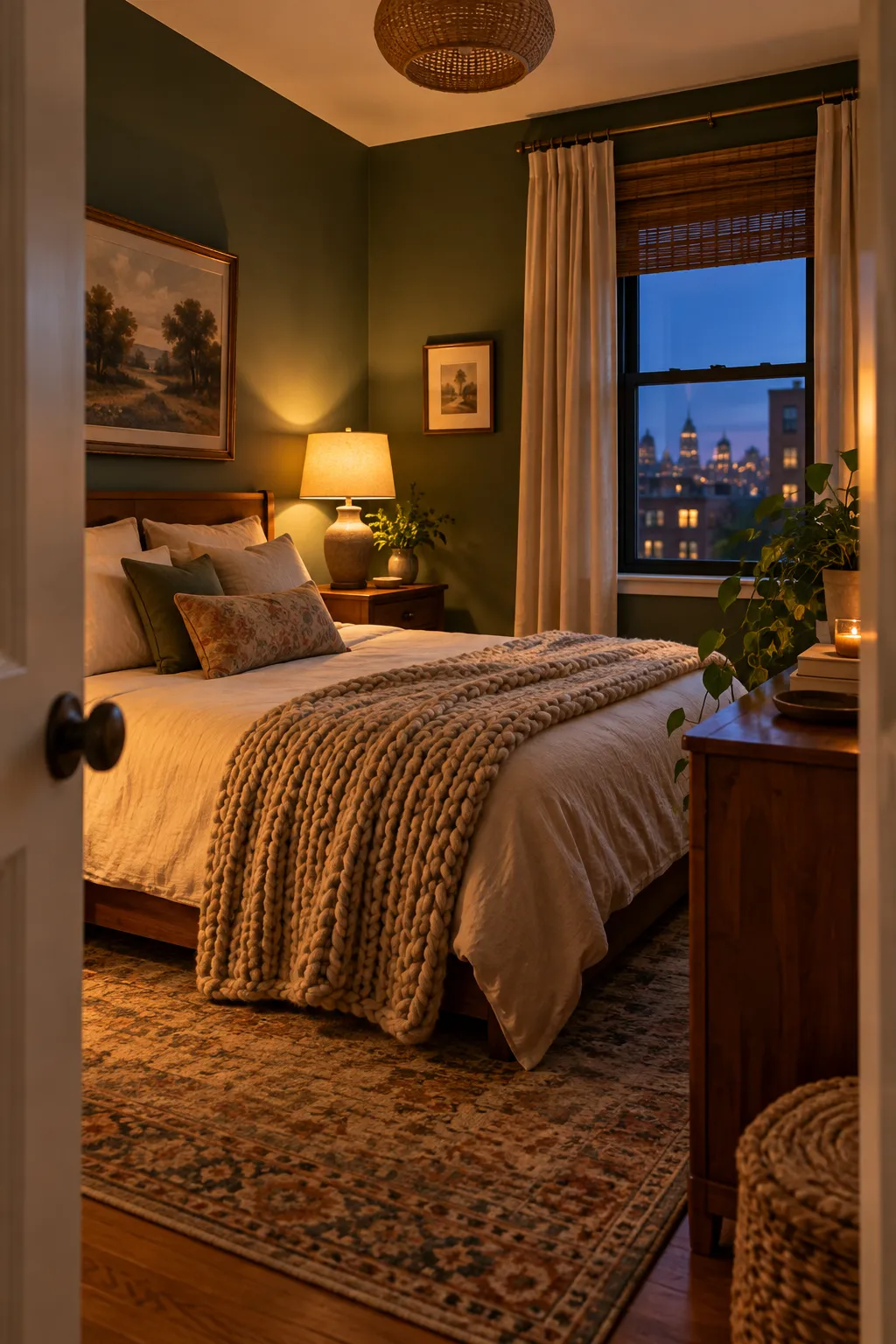
Your answer here matters more than any paint rule. Think about when you use the room most. A home office you work in all day usually wants light, open walls. A bedroom you mostly see at night can carry a deep color well. Write one word in your notes: airy or cozy.
4. Pick three sample colors: one light, one mid-tone, one dark
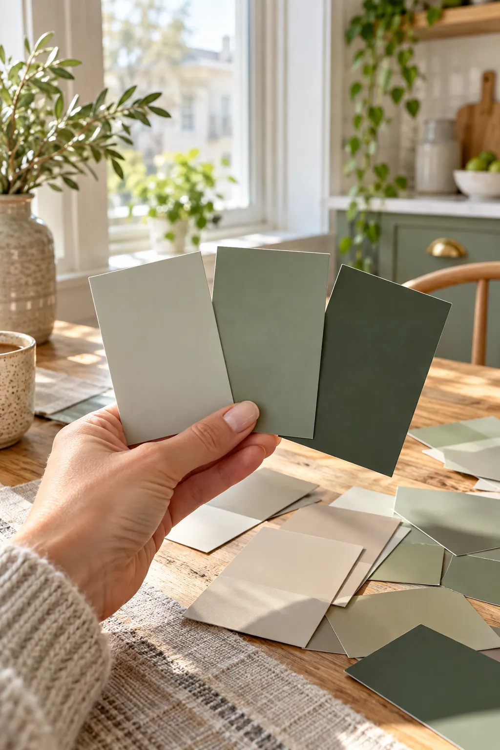
Three colors give you a fair test instead of a coin flip. Choose all three from the same color family, like three greens or three warm beiges. That way you’re comparing light against dark, not sage against navy. Flip each paint chip over, or look it up on the brand’s website, to find its LRV (light reflectance value). Aim for one above 60, one between 30 and 50, and one under 20. If your room faces north or gets little sun, lean toward warm undertones. They keep the light from feeling cold.
5. Paint each sample on a large poster board
If you rent, this step means you never touch a wall until you’re sure. Each color gets two boards, one for the bright spot and one for the dark spot.
- Lay all six boards flat on a drop cloth.
- Write the color name on the back of each board.
- Pour a little paint onto a paper plate.
- Brush a thin coat edge to edge and let it dry 1 hour.
- Add a second coat so no white shows through.
No poster boards? Peel-and-stick paint samples sold online work the same way.
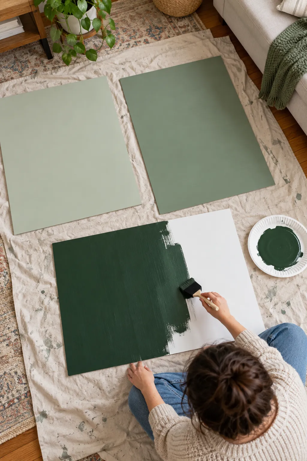
Do not skip the second coat on your dark sample. One coat looks streaky and lighter than the real color, and you’ll judge it wrong.
6. Tape the boards in the brightest and darkest spots
Color shifts across one small room more than most people expect. Put one set of three boards on the wall facing your window, where light hits hardest. Put the other set in the dimmest corner. Hang them at eye level, about 4 inches apart, using loops of painter’s tape on the back. Keep them flat against the wall. A board leaning at an angle catches light differently and gives you a false read.
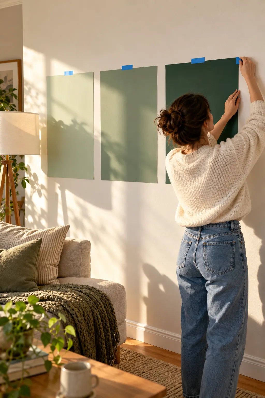
7. Test light vs dark walls in your small room at three times of day
Two days of checking beats one perfect guess. Look at every board at these times:
- Morning, around 9 a.m., in daylight only
- Midday, around 1 p.m., when light is strongest
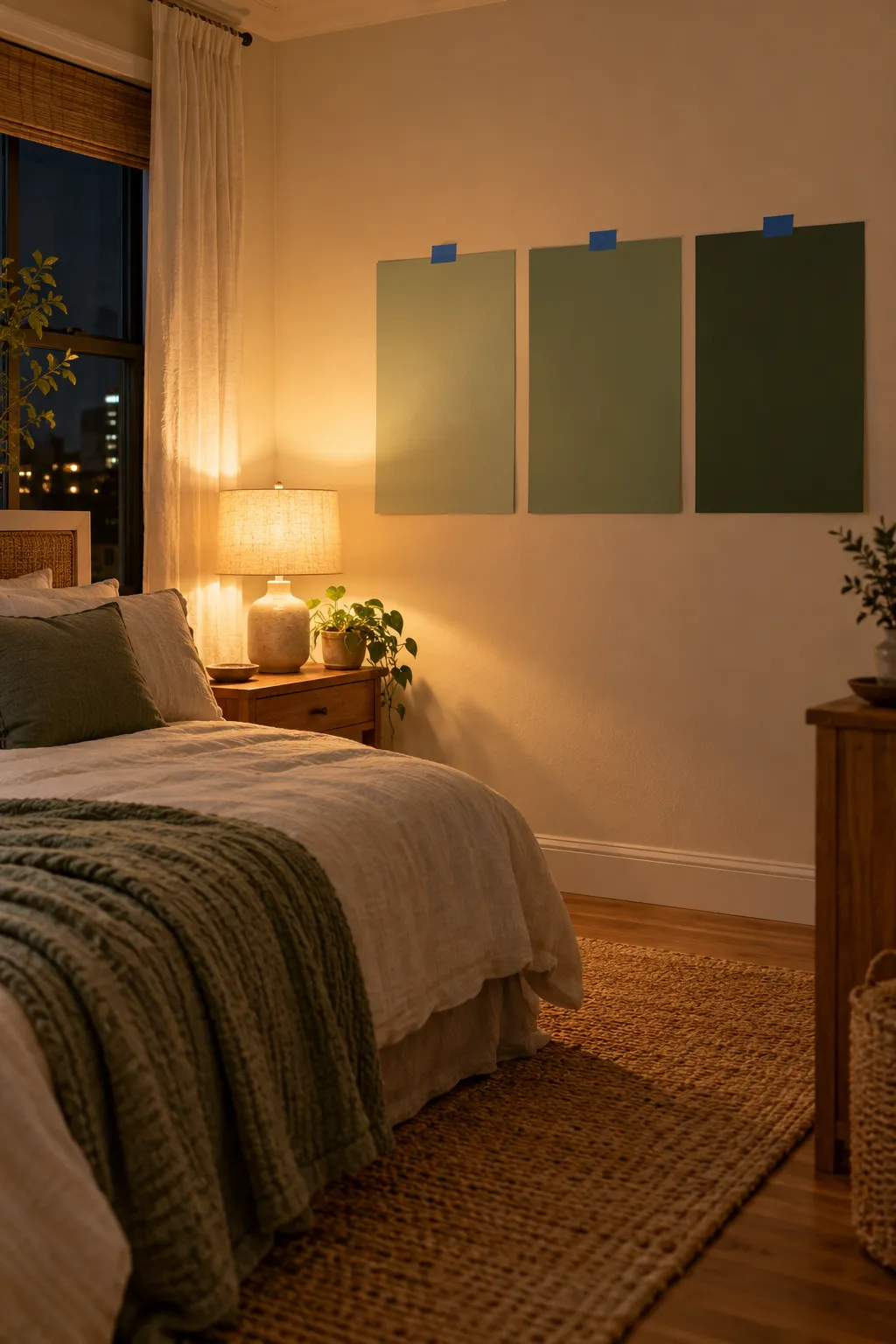
- Night, after dark, with your usual lamps on
Night matters most for bedrooms. Many light colors turn gray under lamps, and many dark colors finally look warm. Snap phone photos if you like, but use them only to compare boards side by side. Cameras shift color, so trust your eyes for the true shade.
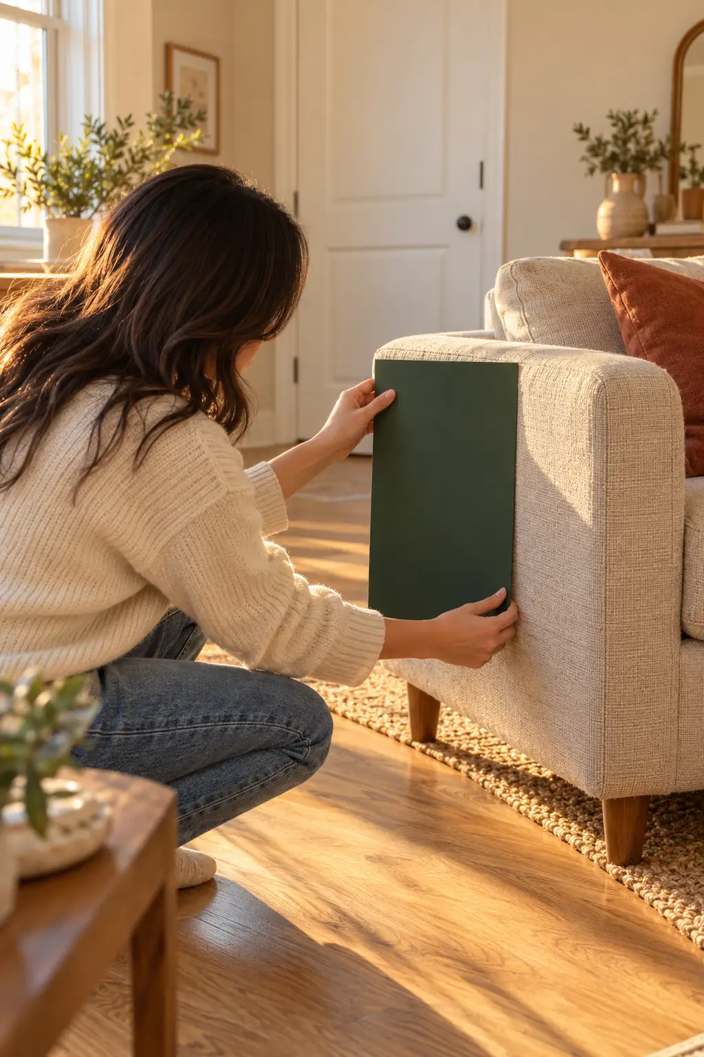
8. Hold each board next to your floor, furniture, and trim
A color can look perfect alone and wrong next to your floor. Take one board down at a time. Hold it above the floor, against your sofa or bed, and beside the door trim. If the undertones fight, like a cool gray beside orange-toned wood, the wall will look dingy. Cross off any color that clashes with something you can’t change.
9. Choose a matte or eggshell finish for your pick
On dark walls, sheen changes the look more than most people expect. Matte has no shine, so it hides bumps and dents, and it makes deep colors look soft and velvety. That soft look helps dark walls seem to fall back. The downside is that regular matte scuffs and is harder to wipe. Eggshell has a faint glow and cleans up with a damp cloth, so it suits light colors and busy rooms. Want both? Look for washable matte or scrubbable matte on the can.
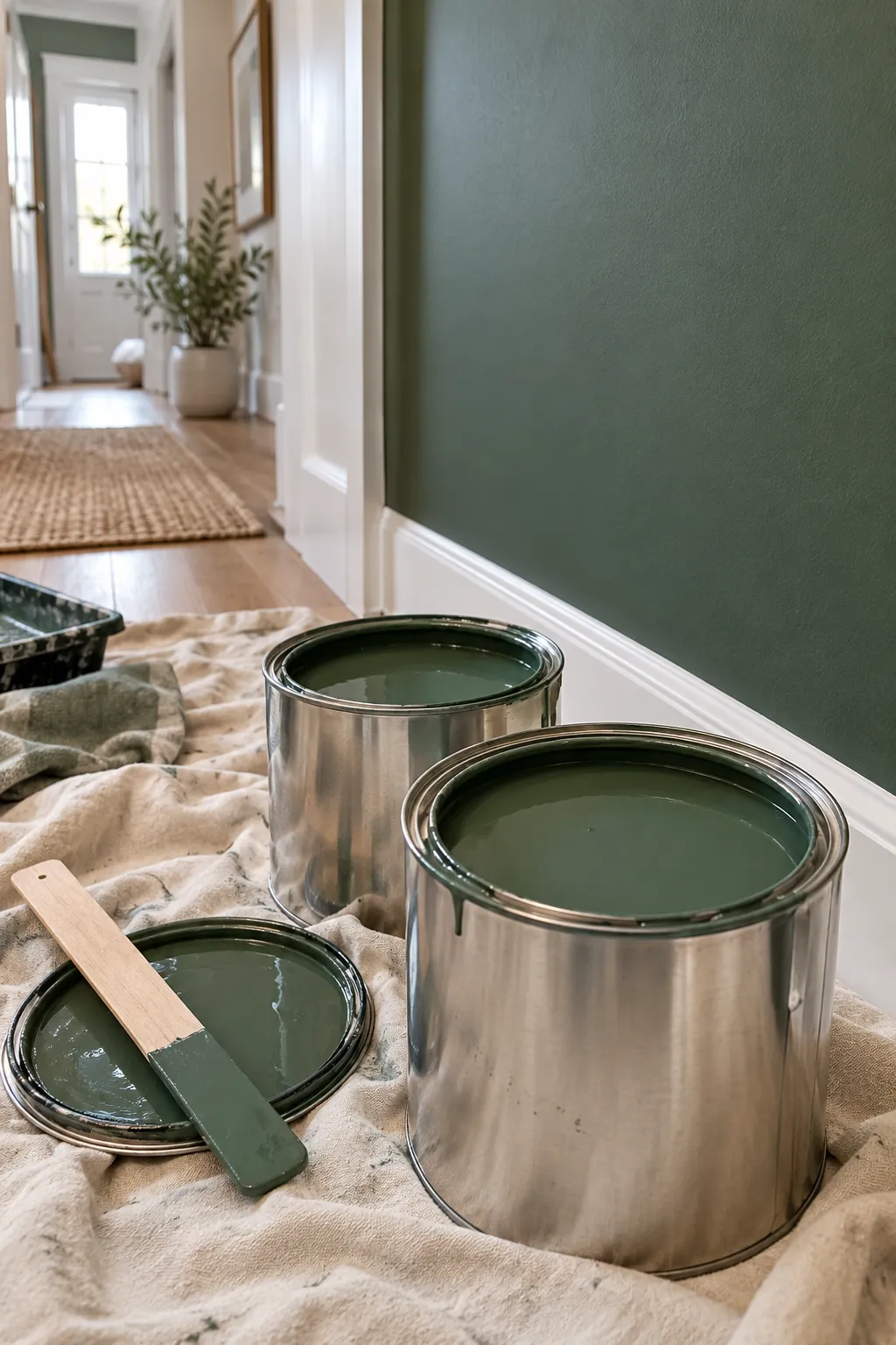
Skip satin and semi-gloss on dark walls in a small room. The shine shows every dent and roller mark, and lamps reflect off it as bright spots.
10. Paint the ceiling and trim to match the walls or go one shade lighter
Designers use one trick in tiny rooms called color drenching. Walls, trim, and sometimes the ceiling all get the same color, so the edges blur and the room feels calmer and bigger. It works best with dark and mid-tone colors. With light walls, a ceiling one shade lighter keeps the room bright. Avoid a stark white ceiling over very dark walls. The hard line makes the ceiling feel lower. Renting? Get your landlord’s approval in writing before you paint anything dark.
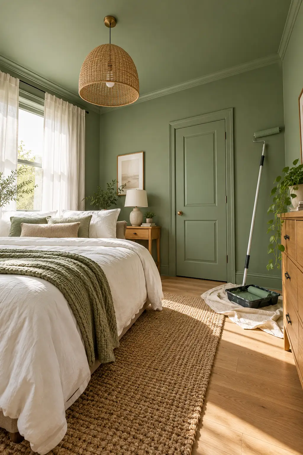
Not always. Dark colors blur the corners, so the walls seem to fall back, especially in matte with matching trim. A dark room only feels smaller when it doesn’t have enough lamp light.
Warm whites and creams with a yellow or red undertone. Cool, blue-based whites tend to look gray in north light.
Often yes, with written approval from your landlord. You may need to repaint before you move out, and covering a dark color takes primer plus 2 coats of the lighter one.
Usually 2, sometimes 3. A gray-tinted primer underneath helps you get full color in 2.
An accent wall is a low-risk way to try a dark color. In a very small room, though, one dark wall can chop the space up, and all four walls in the same color often feels calmer.
Warm white bulbs around 2700K make deep colors look rich. Cool bulbs above 4000K tend to make them look flat and gray.
You now have a real answer to light vs dark walls in a small room, tested in your own light instead of guessed from a tiny chip.
Whichever color won, you picked it for your windows, your floor, and the way you use the room.
Your next step: pick up a gallon of your winner in the finish you chose, plus a gray-tinted primer if you went dark.
Pin this guide to your painting board so the steps are ready when your next room needs a color.