
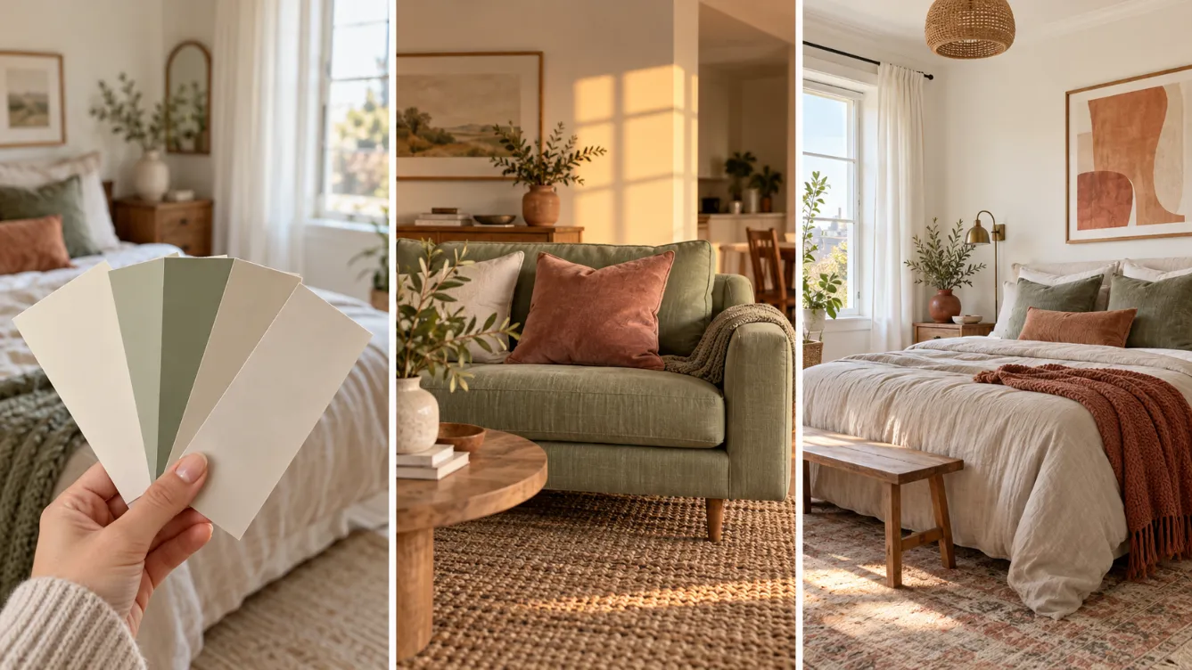
You painted your tiny bedroom a soft light gray, and somehow it looks darker and smaller than before. Or you bought a sage green rug that looked calm online, and now it fights with your orange-toned floors. This happens to almost everyone. The problem is rarely the color you picked. Nobody told you how colors behave in a small room with limited light and finishes you can’t change.
Color theory for small rooms solves that. It sounds like an art school class, but you only need four pieces of it: light direction, undertones, value, and the 60-30-10 split. By the end of this guide, you will have a tested three-color palette and a clear plan for where each color goes in your room.
This method works because it starts with what you already have. Your windows and your floors make a lot of color decisions before you ever pick up a paint chip. You build around them instead of fighting them.
Renters, this is for you too. Paint is optional. Every step works with rugs, bedding, curtains, and decor.
Plan on about 2 hours of hands-on work spread over 3 days. Most of that time is waiting while your samples sit on the wall. Grab a notebook, and start at the window.
- Check which way your windows face
- List the colors you can’t change
- Find their undertones with white paper
- Choose warm or cool for the room
- Pick a light main color (60%)
- Choose a neighbor color (30%)
- Add one accent color (10%)
- Check value contrast in black and white
- Live with samples for 48 hours
- Map where each color goes
- Repeat your accent in three spots
1. Check Which Way Your Windows Face
Sunlight changes color depending on where it comes from, and in a small room with one window, that light tints everything. Stand at your main window, open the compass app on your phone, and write the direction in your notebook.
- North: cool, bluish light all day
- South: warm, bright light most of the day
- East: warm in the morning, cooler by afternoon
- West: soft in the morning, golden by evening
No window? Write “lamps only” and check the number on your bulb base. 2700K means warm light. 5000K means cool light.
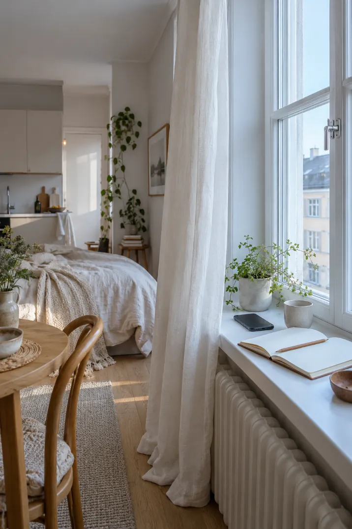
2. List Every Color in the Room You Can’t Change
Floors, countertops, tile, cabinets, rental walls, and the big sofa you are keeping all count. These are your fixed colors. Walk the room and write each one down with a plain description, like “honey oak floor” or “gray-beige carpet.” Your new palette has to get along with every item on this list, so leave nothing out.
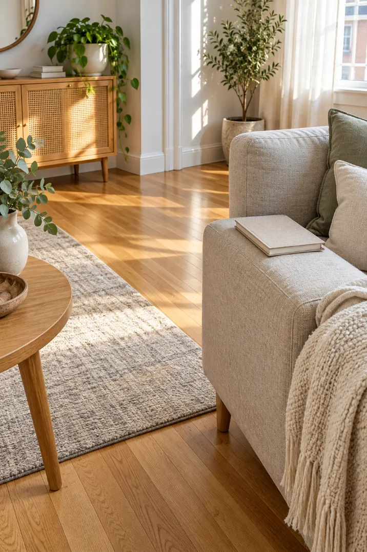
3. Find the Undertone of Those Fixed Colors With a Sheet of White Paper
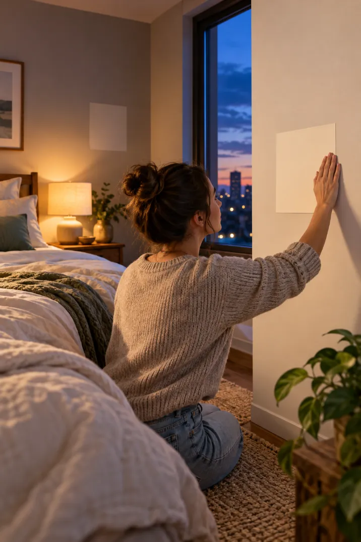
Next to pure white, hidden colors show up fast. Do this between 10 a.m. and 2 p.m., when daylight is most neutral. Hold a sheet of white printer paper flat against each item on your list and look at the item, not the paper.
Leans yellow, orange, or pink? Write “warm.” Leans blue, green, or gray? Write “cool.” Beige and gray floors trick people most, because they almost always lean one way even when they look plain.

4. Choose Warm or Cool for the Whole Room
If most of your notes say “warm,” your room already leans warm. Count your warm and cool marks, and the bigger group wins. Tied, or mostly neutral? Let your window decide. North-facing rooms and lamp-only rooms do better warm, because warm colors soften cool light. South, east, and west rooms can go either way, so pick the one you like. Circle your answer at the top of a fresh notebook page.
5. Pick a Light Main Color to Cover 60% of the Space
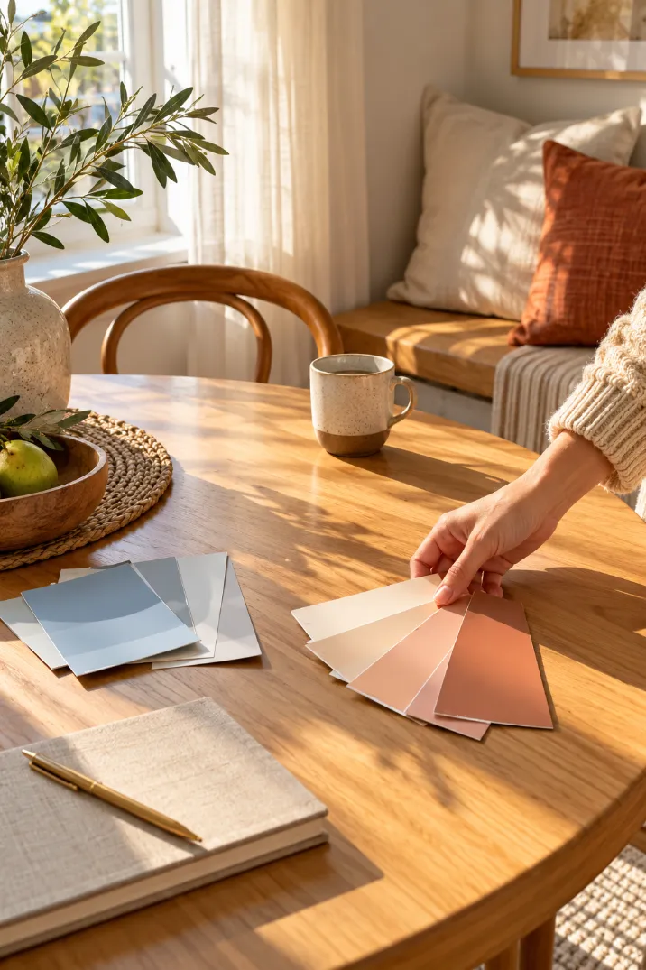
Sixty percent means your walls plus the biggest fabric in the room, like curtains or a large rug. Pull out only the swatch cards that match your circled temperature. On each strip, look at the top two or three chips, then choose one. Light colors bounce more light around, which blurs the corners and makes walls seem farther away. Check the back of the card or the brand’s website for the LRV number, and aim for 60 or higher.
Renting with white walls you can’t paint? Your walls are already your main color. Write it down and move to Step 6.
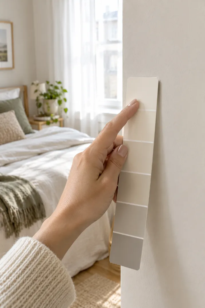
6. Choose a Neighbor Color on the Wheel for the Next 30%
Ever notice how blue and green almost never clash? They sit side by side on the color wheel and share some of the same pigment, so your eye slides from one to the other without stopping. That smooth flow helps a small room feel calm and open. Find your main color on the printed wheel. Pick a color one or two spaces away on either side, in a shade a little deeper than your main color. It goes on the sofa, bedding, or a rug.
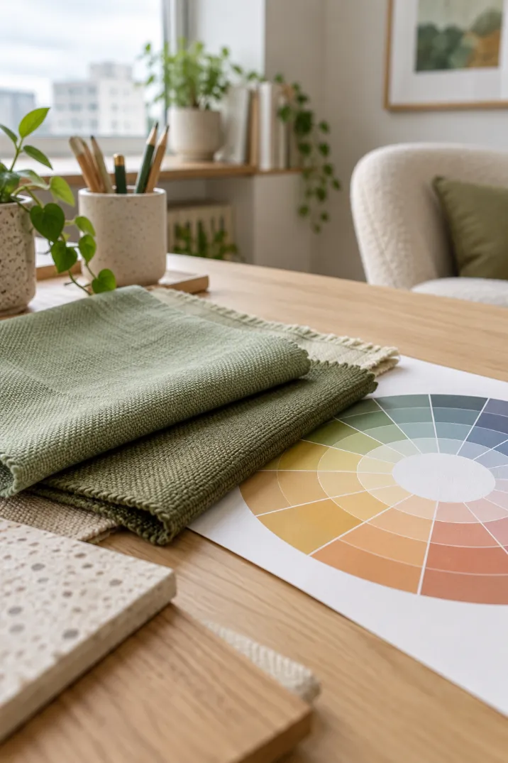
7. Add One Accent Color for the Final 10%
Here is where the room gets its personality. Look straight across the wheel from your 30% color to find its opposite, called a complementary color. Opposites make each other look brighter, so a small amount pulls the eye and gives it a place to land. In a small room, that keeps people looking at a pillow or a print instead of noticing the walls. Pick a muted or dusty version of the opposite. A sage room, for example, gets warmth from dusty rose or rust.
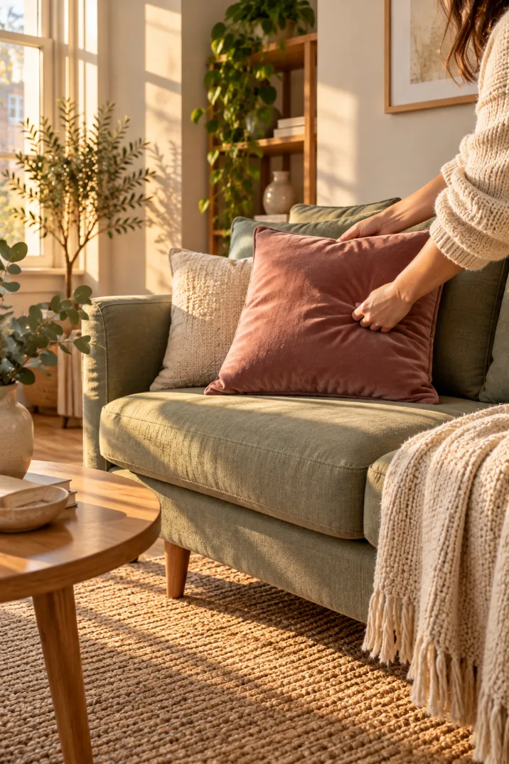
8. Check Value Contrast, the Step of Color Theory for Small Rooms Most People Skip
Value means how light or dark a color is, with the color itself taken away. Lay your three swatches side by side on white paper and snap a photo with your phone’s black-and-white or “Mono” filter. You want three clearly different grays: light, medium, and dark. Two that look the same? Swap one for a lighter or darker chip on the same strip. Matching values make a room look flat, even when the colors are different.
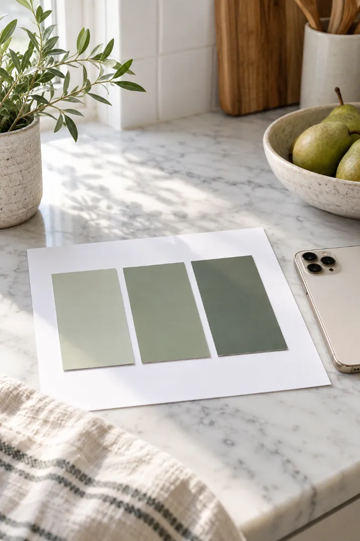
9. Live With Your Samples for 48 Hours Before Deciding
A tiny chip and a whole wall can look like two different colors. Test bigger.
- Stick one main-color sample near the window.
- Stick a second one in the darkest corner.
- Drape fabric in your 30% and 10% colors over the bed or sofa.
- Check all of them in the morning, afternoon, and night.
Using sample pots? Paint 2 coats on a 12 x 12 inch piece of foam board instead of the wall, so your old wall color can’t change how the new one looks.
10. Map Where Each Color Will Go
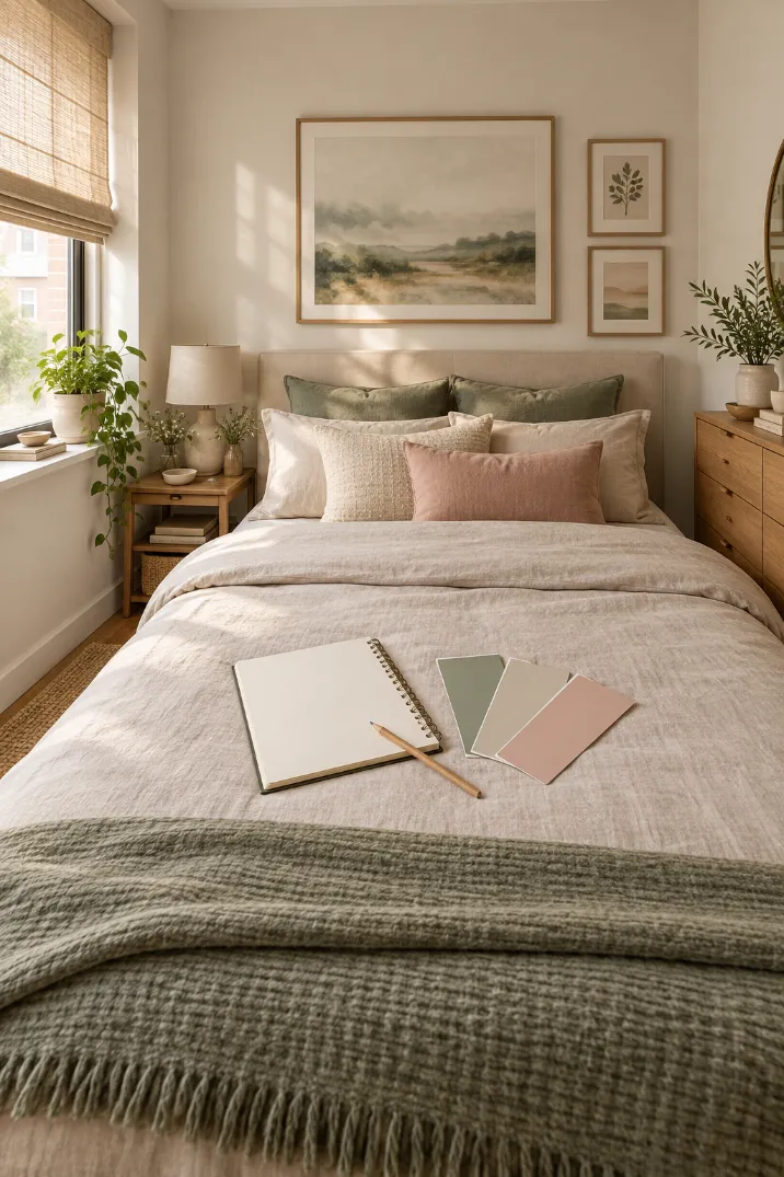
Once your palette survives the 48-hour test, it needs a plan. Sketch your room as a box in your notebook, as if you were looking down from the ceiling. Mark the walls, rug, bed or sofa, curtains, and shelves, then label each one M (main), S (secondary), or A (accent). Count the labels as a gut check: lots of M, fewer S, only a few A. If you are painting, use the main color on the trim too, because matching trim hides where the walls end.
11. Repeat Your Accent Color in Three Spots
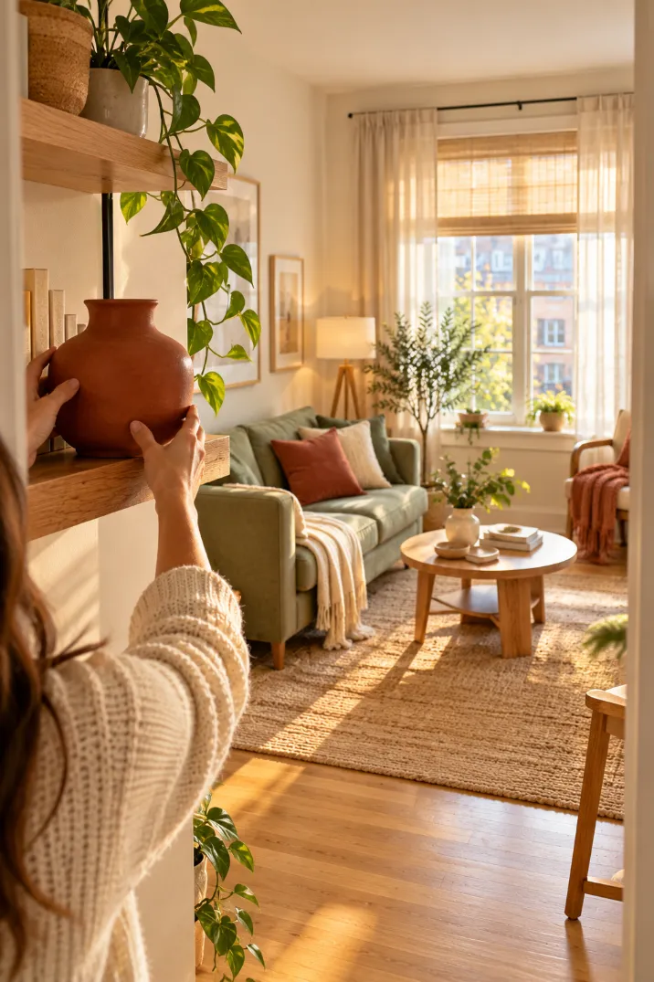
Three spots spread across the room form a loose triangle, and the eye follows it all the way around. One lonely accent piece looks like a mistake. Three look planned, and they make the room feel wider. Place them at different heights:
- One at eye level, like a framed print or a vase on a shelf
- One low, like a pillow or a throw at the foot of the bed
- One on the far side of the room from the other two
Stand in the doorway and look. If your eye stops on one spot, move that item farther from the others.
Troubleshooting Your Small Room Colors
Color Theory for Small Rooms FAQ
- White printer paper
- Phone (compass + camera)
- Printed color wheel
- Paint swatch cards
- Peel-and-stick samples or sample pots
- Painter’s tape
- Notebook and pen
- Fabric scraps (renters)
- Note your window direction
- List colors you can’t change
- Find their undertones with white paper
- Choose warm or cool
- Main color, light, LRV 60+ (60%)
- Neighbor on the wheel (30%)
- Muted opposite as accent (10%)
- Black-and-white photo: light, medium, dark
- Test samples for 48 hours
- Sketch and label M, S, A
- Repeat accent in 3 spots
Your Small Room Is Ready for Color
You now have a three-color palette that works with your light, your floors, and the size of your room.
You tested it, mapped it, and placed your accent where the eye will travel.
That is color theory for small rooms doing real work in your own home.
Next, try the same steps in a hallway or entryway, where small spaces need the most help.
Save this pin so your palette steps are ready when you start the next room.